Built to host cultural activities and connect communities, Wisma Geylang Serai (WGS) is a place where Malay culture and heritage can be kept alive and passed on to the younger generation. Accompanying its refreshed architecture, WGS called for proposals to develop a brand identity to reflect the cultural commitment of the new compound.
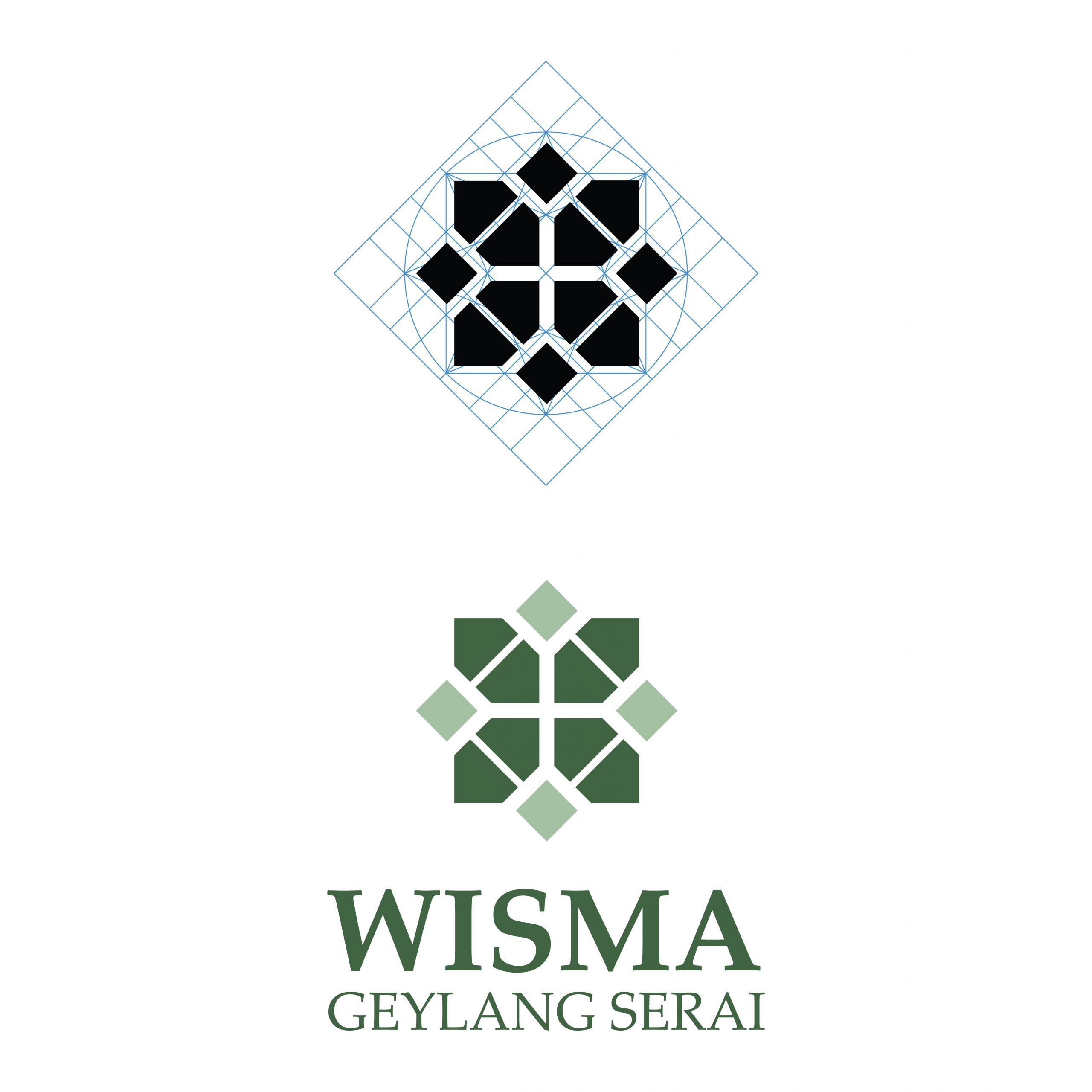
We approached the design from a traditional radial grid common to Islamic patterns to signify the role of WGS, as a core centre to propagate the Malay culture and influence the future generations to come. The radial grid also symbolizes harmony, an open inclusiveness to invite everyone, embodying the WGS brand.

Logo development:
Radial grid
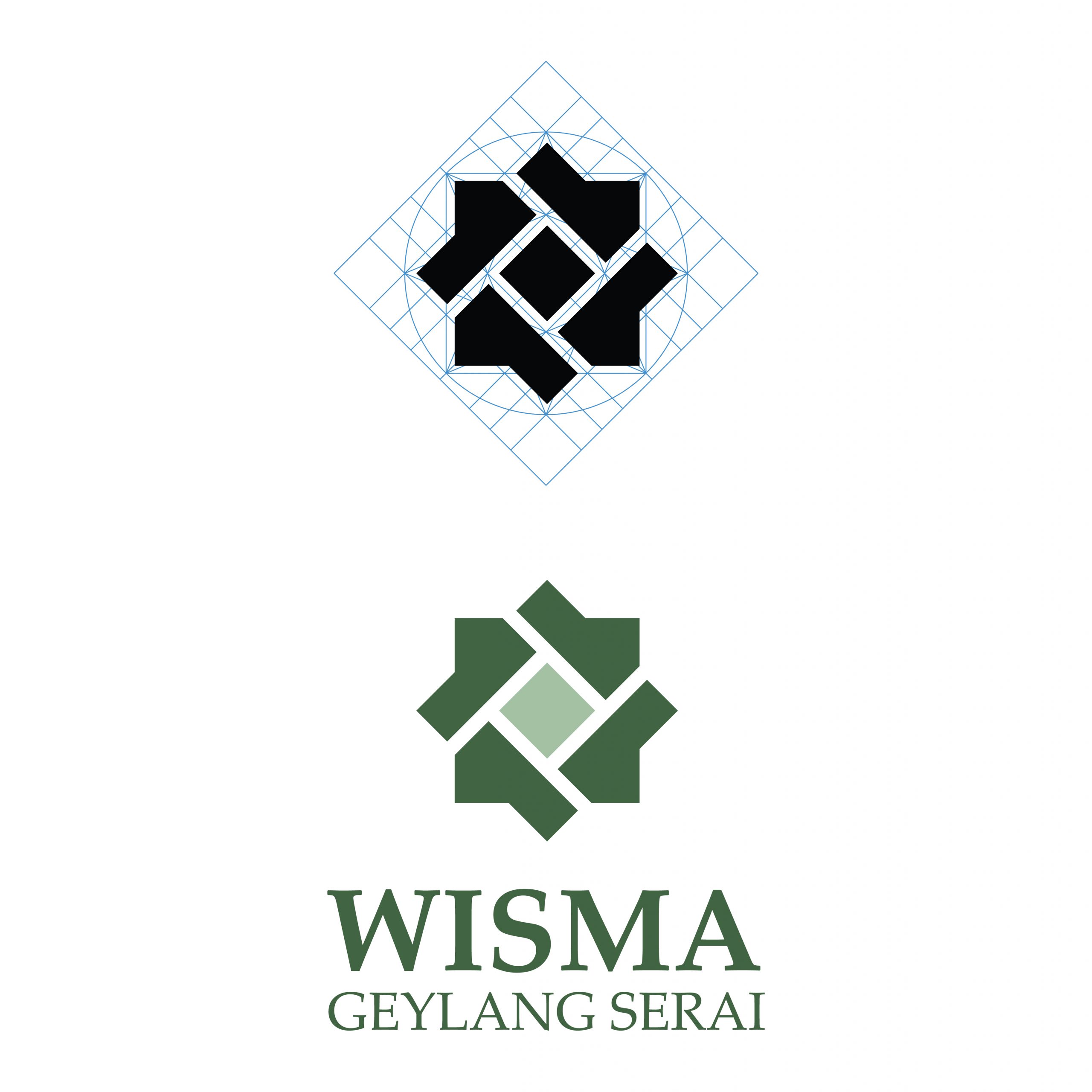
The logo options are created based on a traditional radial grid common to islamic patterns.
Logo development:
Variation 1
Using the ‘house’ motif, an inward looking and outward looking pattern is created signifying the accepting nature of the place at the same time the outwardly influence it has on culture.
Logo development:
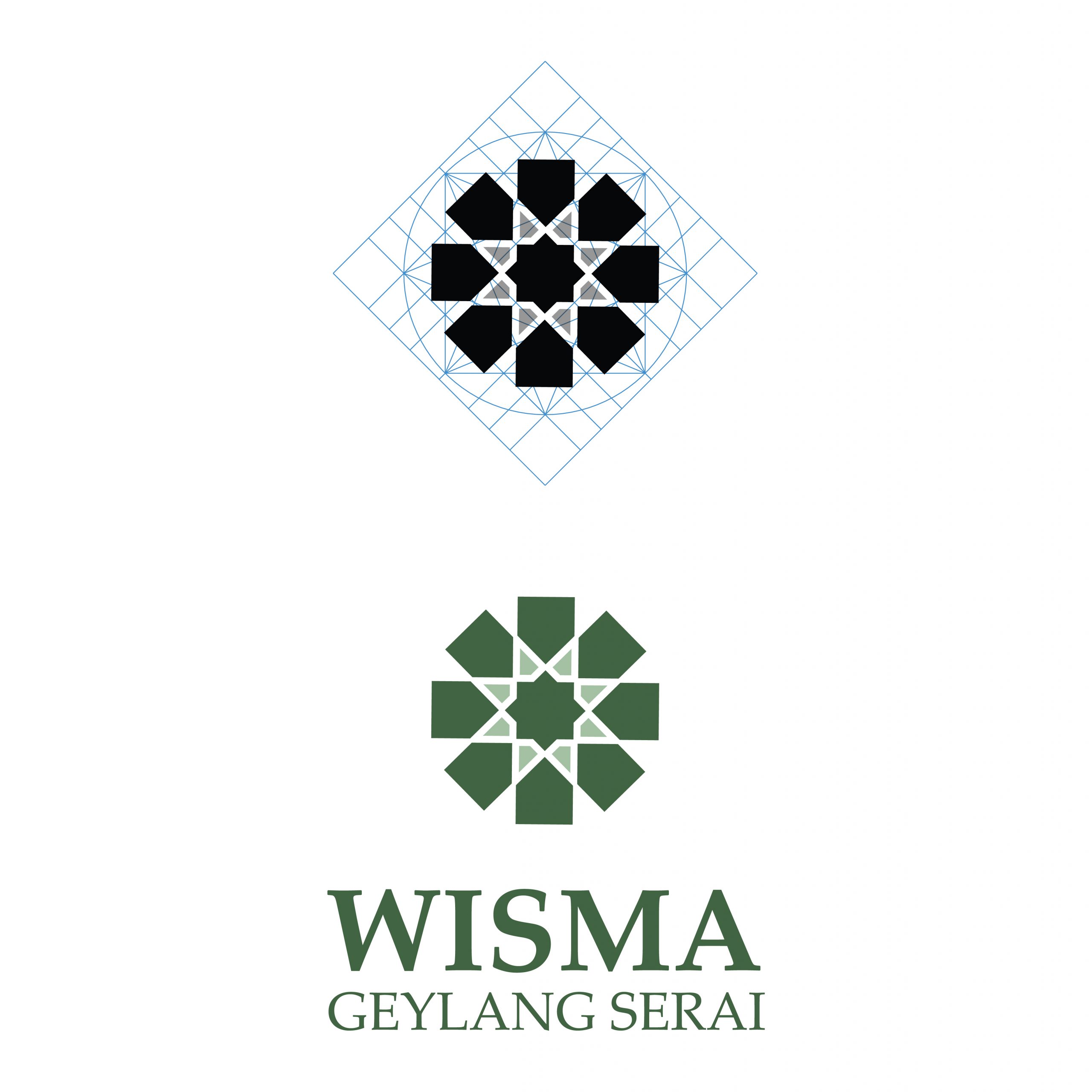
Variation 2
This version features a central courtyard surrounded by shophouses. The central courtyard suggests the gathering of community surrounded by culture, represented by the shophouses.
Logo development:
Variation 3
This version features a central courtyard surrounded by inward pointing houses and carries the message of the gathering of people within place and stresses the key importance of community.
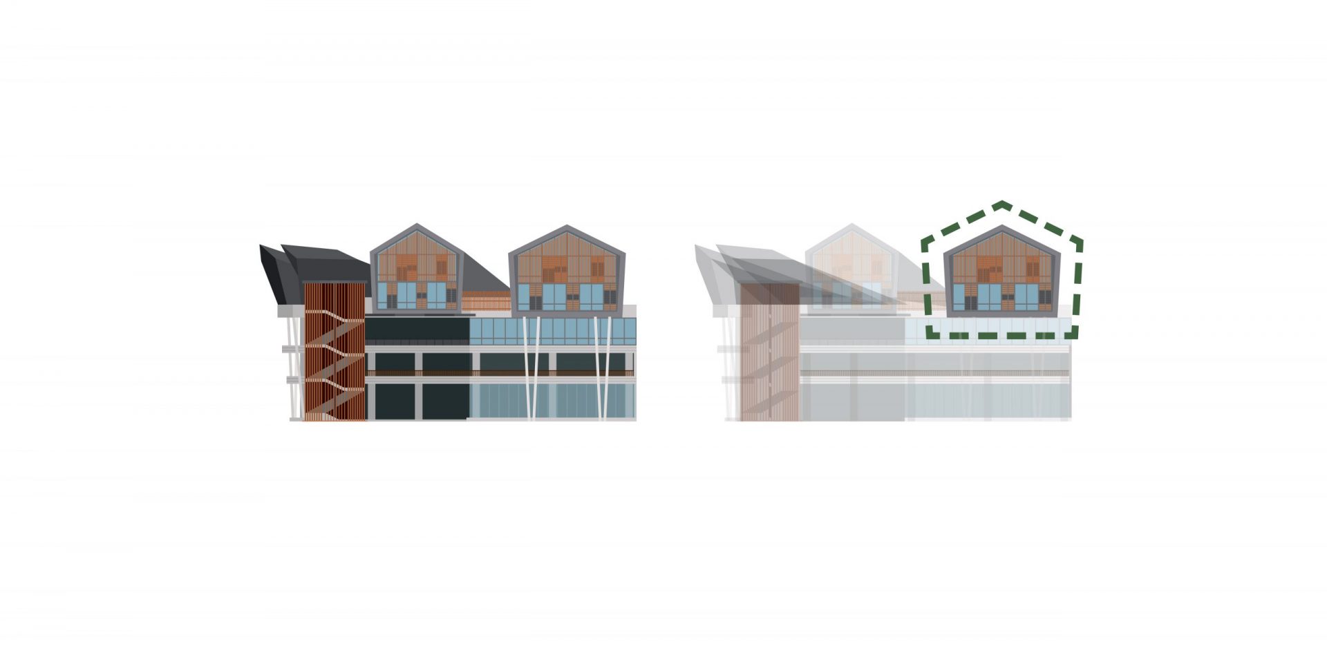
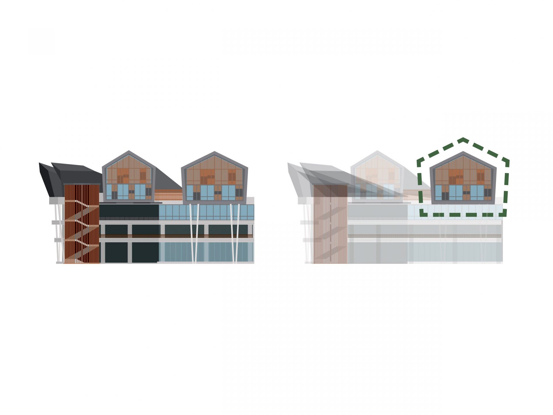
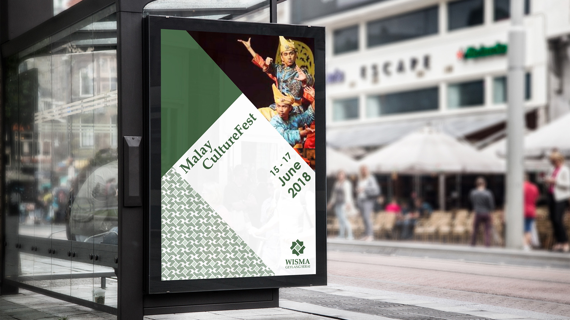
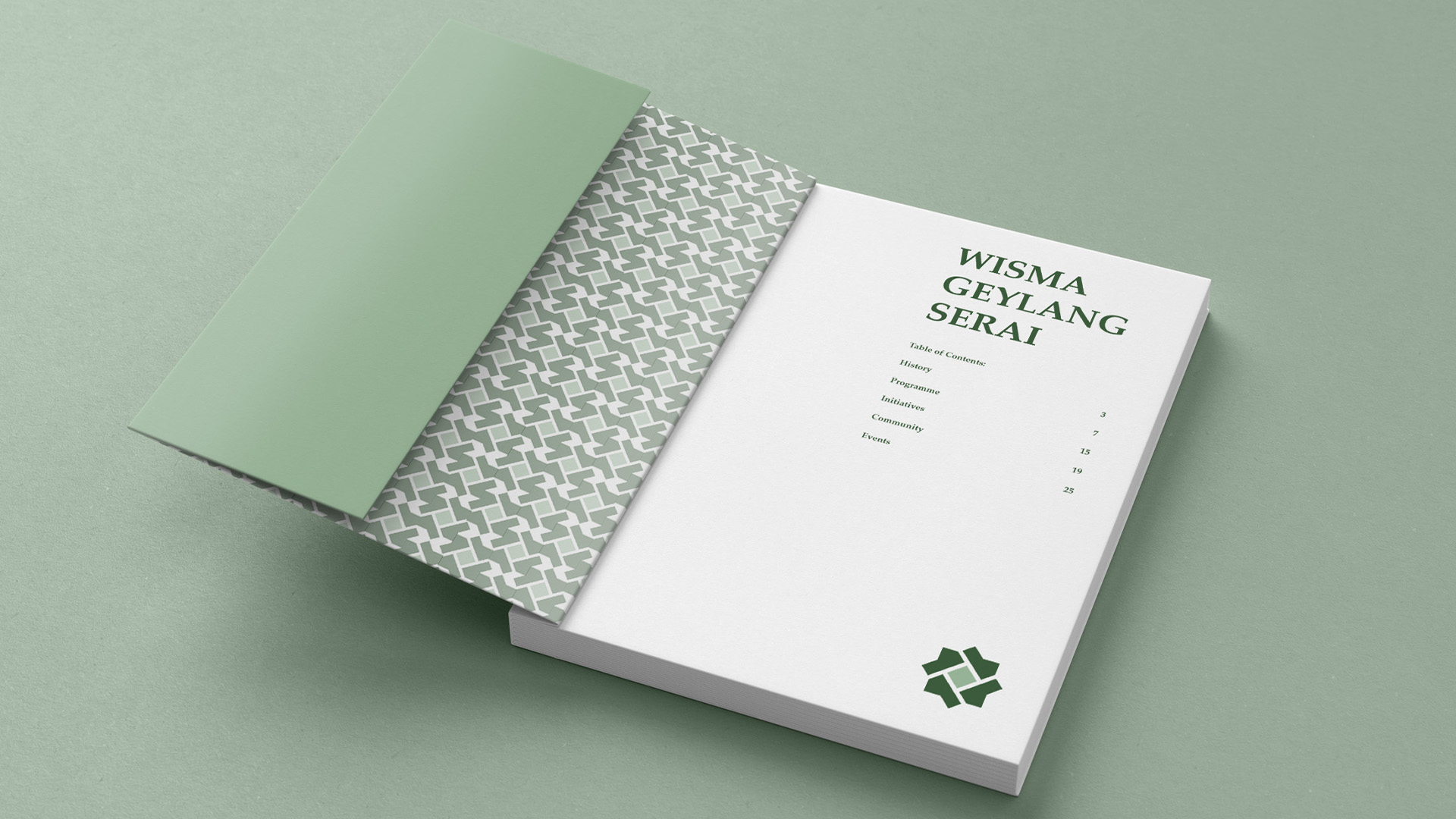
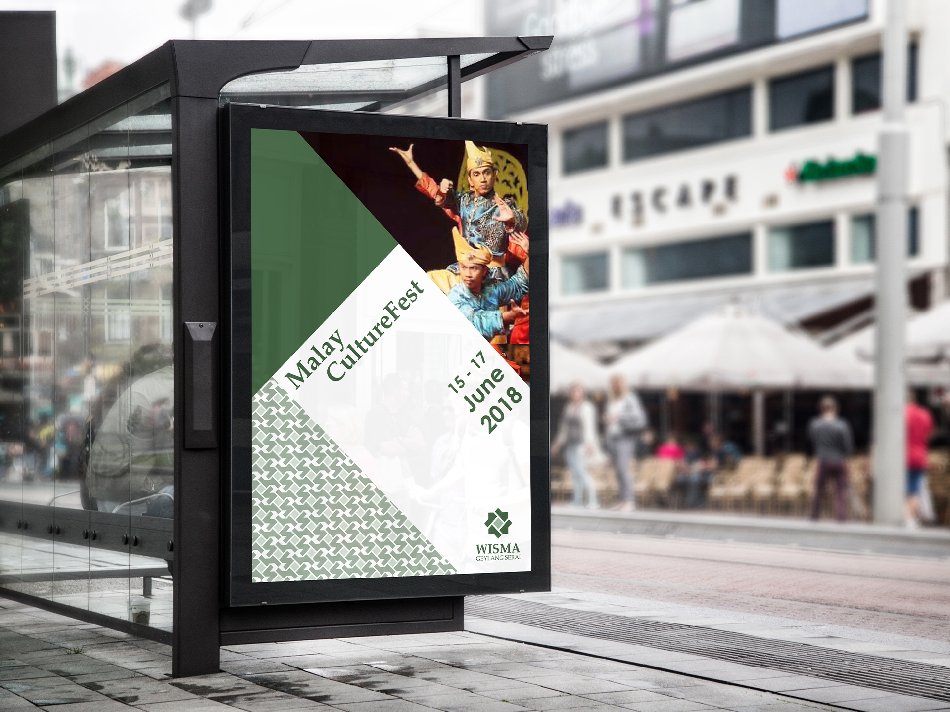
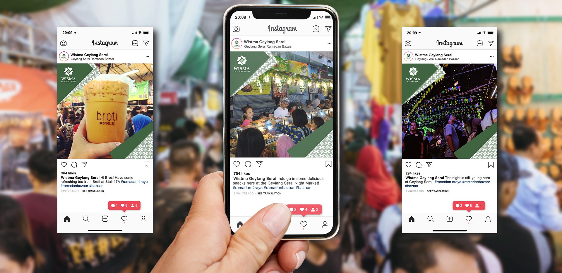
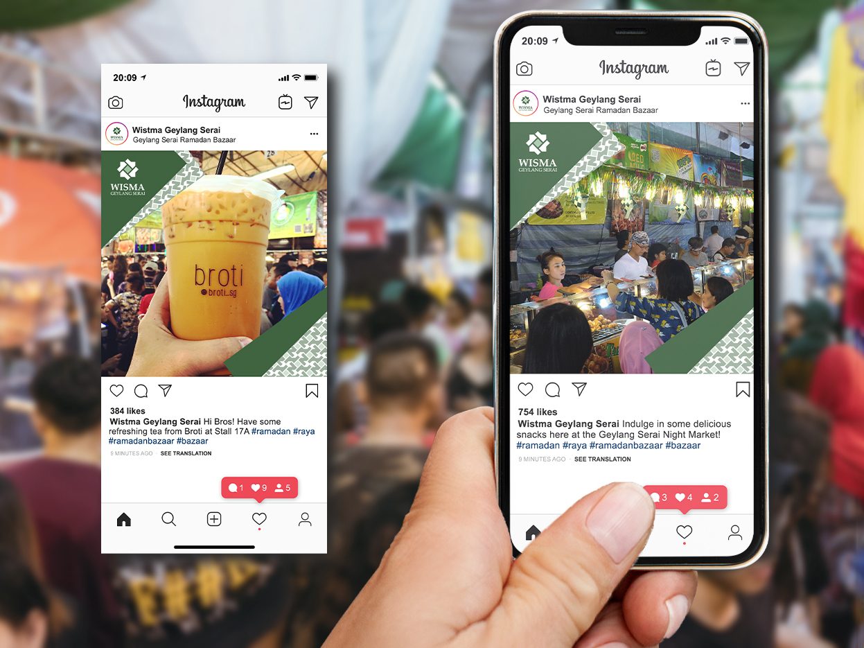
The house motif created a visual relevance to the architecture, which featured a similar visual and concept. The primary brand assets such as logos and ad grids were created from the concept of the radial grid which helped to create a contemporary look upon a traditional composition. An extended application of the brand is the patterns created from a seamless permutation of the logo motif.
A motif was created from the starting point of the radial grid. This was then adapted to patterns, ad grids that are applied across branding communication.


